Four briefs went in, one design system came out
Before releasing ux-skill 4.0 I had it tried on four briefs that should share nothing. It built the same system four times. The rule that fixed it, and the prompts.
On this page
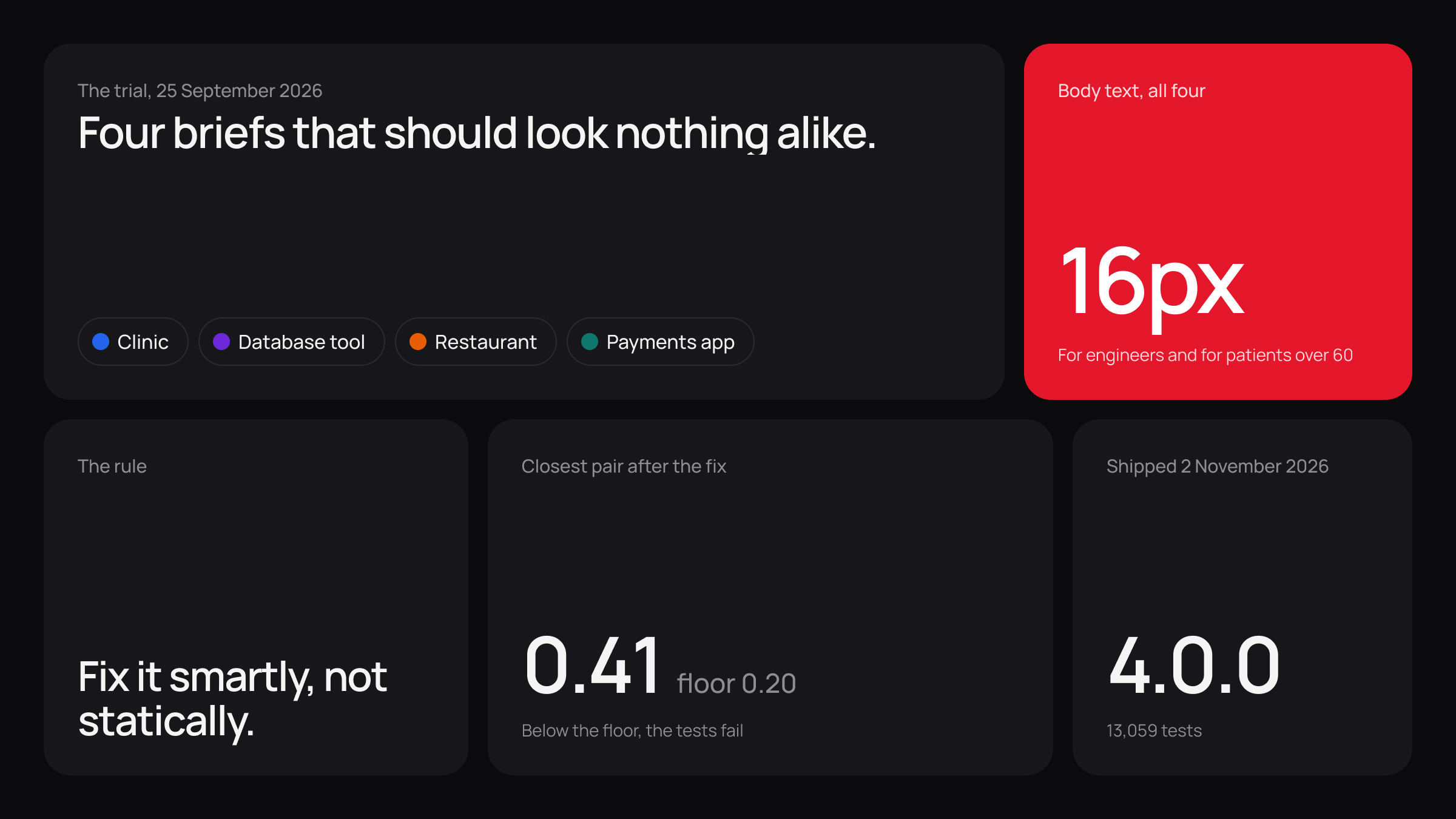
ux-skill is my open-source design engine. You give it one brand colour and a brief, and it builds a design system: colour, type, spacing, corners, motion. It exists because pages built by AI tools all look the same, and I wanted them to stop.
On 25 September 2026 version 4.0 was close. The engine built systems, and each one passed all 324 checks for contrast, the test that text can be read against its background. The demos so far were small: the engine running on a single card. A card proves nothing about a brand.
So I had it tried on real sites before going any further. This is the trial, as a prompt you can reuse on your own tool:
Before we release, build four design systems from four briefs that should share nothing: an Arabic-first payments app for shop owners, a database tool for backend engineers that is dark by default, a warm and playful family restaurant, and a clinic where many patients are over 60. Put the four side by side and list everything that came out the same.This is for anyone who builds a tool that generates things: design systems, layouts, copy, code. You need no code to follow it.
What came out the same?
Nearly everything.
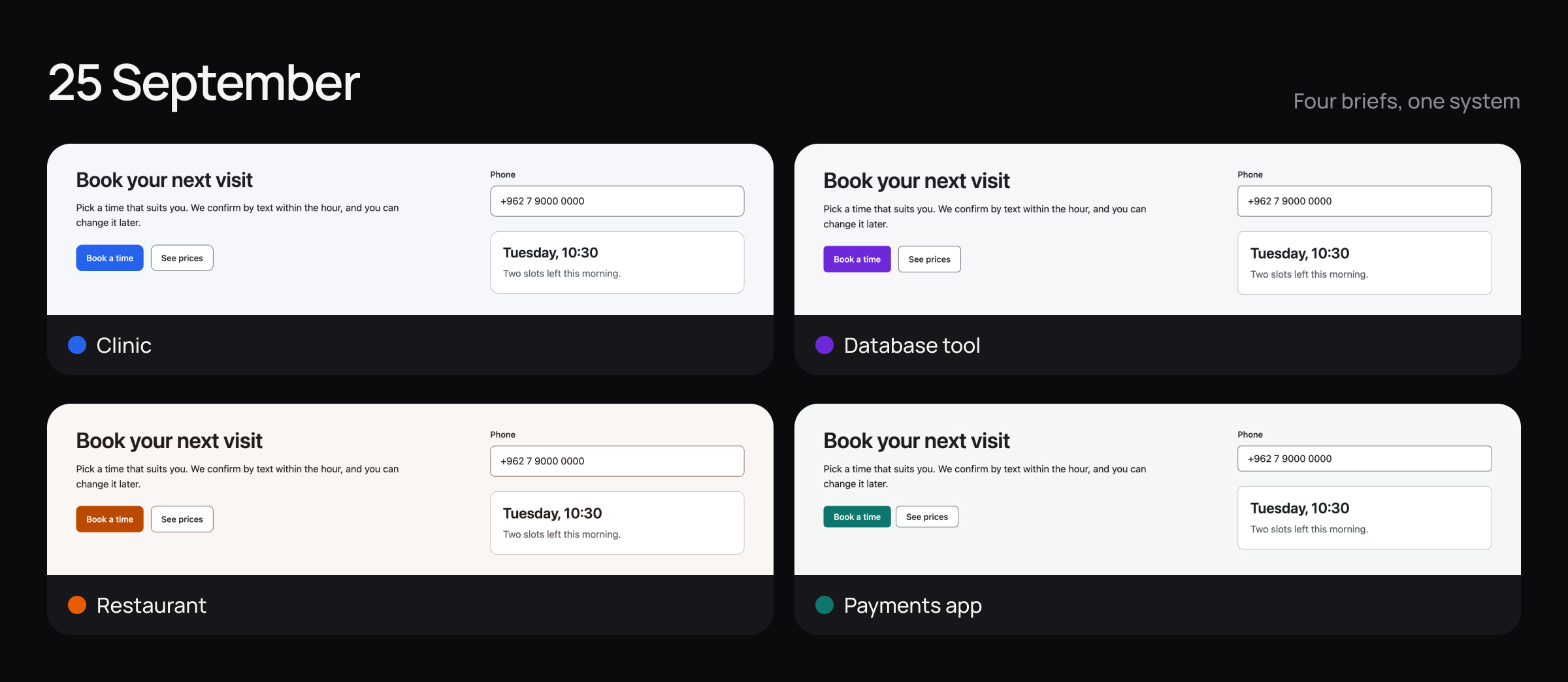
I measured the four systems that version builds:
| Brief | Body text | Heading face | Body face | Button corners |
|---|---|---|---|---|
| Clinic, patients over 60 | 16px | Source Sans 3 | Source Sans 3 | 10px |
| Database tool, dark first | 16px | Manrope | Manrope | 6px |
| Family restaurant, playful | 16px | IBM Plex Sans | IBM Plex Sans | 8px |
| Payments app, Arabic first | 16px | IBM Plex Sans | IBM Plex Sans | 6px |
The clinic for people over 60 got the same 16px text as the tool for engineers. The playful restaurant got the typeface of the payments app. Every system used one face for headings and body. The blue for an information message was the same colour in all four.
It was worse than the table shows:
- The brief was read and dropped. The engine printed that it did not recognise “many over 60”, ignored it, and then reported that nothing needed doing.
- The fonts were names only. Each system named a typeface and shipped no way to load it, so a real page fell back to whatever the computer had. That is why the four pages above share one face.
- The brand colour was changed. The restaurant’s orange, #E85D04, became #BB4900 on the button so that white text would pass contrast. Dark text on the real orange would have passed too.
All four systems passed every contrast check. The checks asked whether each system was correct. None asked whether two systems were different.
What is the wrong fix?
The fast fix is a table. Restaurant means round corners and a friendly font. Clinic means large text. Developer tool means sharp and dark.
That is a dead end. A table is a template with more rows. It breaks on the first brief nobody listed, and it gives every restaurant in the world the same restaurant. It is the sameness the tool exists to beat.
I was shown the list of findings. My ruling was one line:
All correct. Fix it smartly, not statically.Statically is the table. Smartly means every value is worked out from this brief and this brand, on a range wide enough that a person can see the difference. The same rule, written out so you can hand it to your own tool:
Do not add a lookup table per industry or per category. Work out every value from this brief and this brand: text size, typeface, corners, spacing, colour roles, motion. Use a range wide enough to see with the eye. Read who the product is for: age, languages, which script comes first, light or dark by default, read at a desk or on the go. Write the reason for each value into the report. If you could not read something in the brief, say what and how to give it to you. Never report that nothing needs doing.How do you test “different”?
“Make them different” is not something a tool can pass or fail. A number is.
So difference became a measurement. For every pair of systems, the engine compares what a person sees at a glance, colour, type, sizes, corners, shadows and spacing, and returns one distance: 0 means identical, and 1 means they differ in everything. A floor is set at 0.20. If any pair of the trial briefs is closer than that, the test suite fails, and a change that fails the suite does not get in.
For every pair of outputs, measure how far apart they are in what a person sees at a glance: colour, type, sizes, corners, shadows and spacing. Give me one number per pair, where 0 means identical and 1 means they differ in everything. Set a floor. Fail the tests if any pair is closer than the floor.The character work went in the same day: 44 changes between 09:22 and 16:31. The rest of 4.0 took five more weeks.
What do the four look like now?
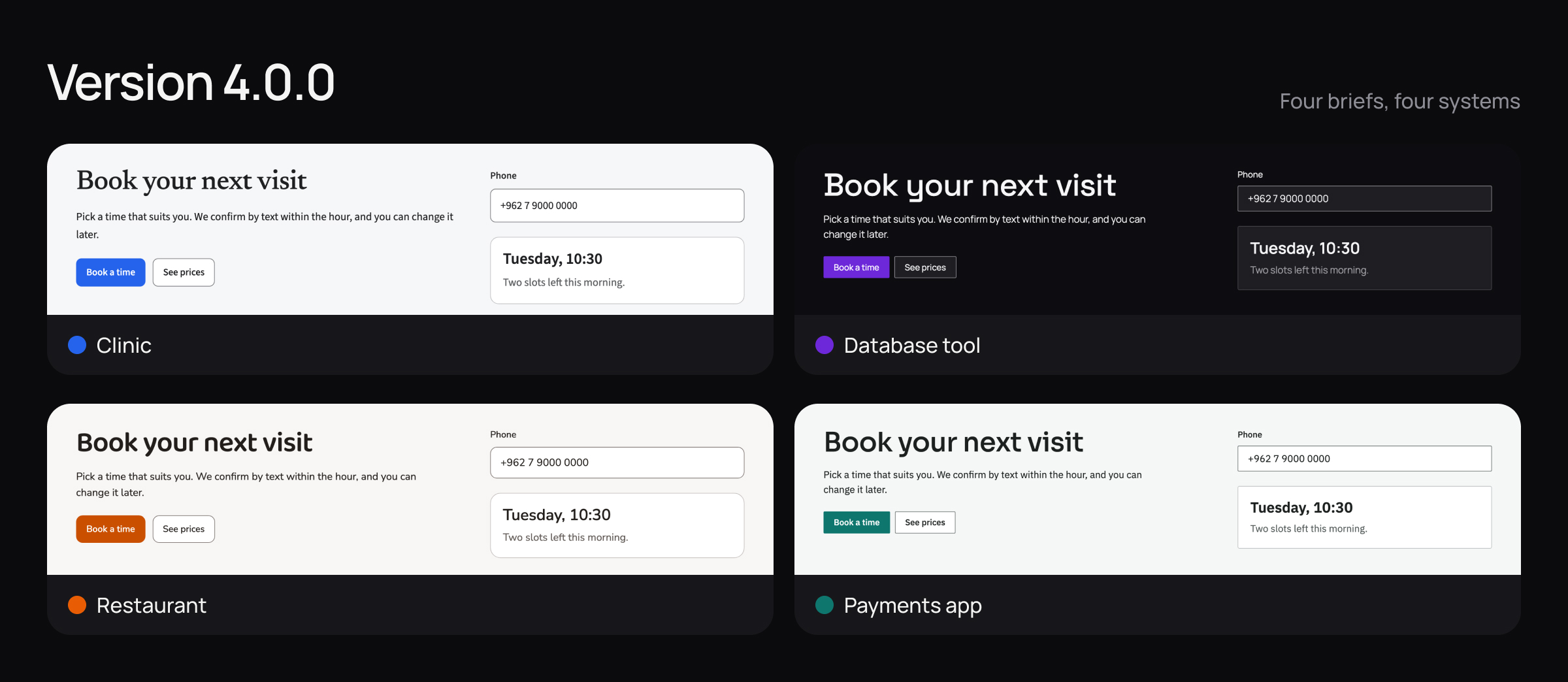
| Brief | Body text | Heading face | Body face | Button corners |
|---|---|---|---|---|
| Clinic, patients over 60 | 18px | Newsreader | Source Sans 3 | 9px |
| Database tool, dark first | 16px | Space Grotesk | Manrope | 2px |
| Family restaurant, playful | 17px | Baloo 2 | Nunito Sans | 11px |
| Payments app, Arabic first | 16px | Sora, and Alexandria for Arabic | IBM Plex Sans | 2px |
The clinic’s text is larger because the brief said who reads it, and the report says so. The database tool opens dark because its brief asked for it. Each system has a heading face apart from its body face, and ships the way to load both. The information blue is now four different blues, each tuned to its brand.
Two of them still share 16px text and 2px corners: the database tool and the payments app. They differ in face, colour and layout, which is why their distance is 0.46 and not zero.
The six distances, over the floor of 0.20:
| Pair | Distance |
|---|---|
| Clinic and database tool | 0.41 |
| Clinic and restaurant | 0.53 |
| Clinic and payments app | 0.46 |
| Database tool and restaurant | 0.56 |
| Database tool and payments app | 0.46 |
| Restaurant and payments app | 0.54 |
One thing is still not right. The restaurant’s button is #CA5000 in 4.0.0. That is closer to the brand’s #E85D04 than September’s #BB4900, and it is still not the brand’s orange.
The four pages are fine. None of them is a page you stop and stare at, and I accepted that for this release: 4.0 is called Foundations because that is what it sets. The engine had 3,315 tests on the morning of the trial. Version 4.0.0 shipped with 13,059.
Was it released when I said it was?
No, and the same kind of check would have caught it.
I tagged 4.0.0 as released on 2 November. On 11 November I looked at what a stranger gets when they install it. The public registry, the place an install command downloads from, still served 3.2.0, published on 23 September. The release notes said 4.0. The install said 3.2. It stayed that way for ten days, until 4.0.0 went up on 12 November.
It is the September failure again. I had checked my side: the code, the tag, the notes. I had not checked what a person receives. That check is now part of every release:
After every release, install the package from the public registry on a clean machine, the way a new user would. Print the version. If it does not match the release, the release is not out. Tell me before anyone else finds it.If you build a tool that generates things
- Instead of testing one output for correctness, test four outputs against each other.
- Instead of choosing test inputs that are easy, choose inputs that should share nothing.
- Instead of fixing sameness with a table per category, work every value out from the input.
- Instead of asking for “more variety”, measure the distance between outputs and set a floor.
- Instead of letting the tool skip what it could not read, make it say what it skipped.
- Instead of trusting your release notes, install your own product as a new user would.
The question I expect: four briefs is a small sample, so why trust it? I do not use it as a measure. Four briefs that should share nothing are enough to catch a tool that makes everything alike, and they are few enough to put on one screen and judge by eye. The floor covers the rest: that test runs on every change proposed to the engine.
ux-skill is free and open source. The project page has the details and the link to the code.