We read 150 shadcn/ui repos. The sameness is not purple.
Taken apart, number one. The most-starred shadcn/ui projects on GitHub run on one of two typefaces and a grey primary. The violet gradient everyone blames comes from somewhere else.
On this page
Everyone who builds with AI knows the look: one typeface, a violet gradient, the same soft cards. The usual suspect is shadcn/ui, because it sits under so many of those apps. So I stopped guessing and read the code.
What I measured
I took the 150 most-starred repositories on GitHub tagged shadcn-ui, on 25 September 2026. For each one I read the files that decide how an app looks: the root layout, the Tailwind config and the global stylesheet. Two things were recorded.
- The typeface, from
next/fontimports, Google Fonts links andfont-familydeclarations. - The primary colour, from the first primary colour value in the stylesheet, sorted by hue into neutral, blue, violet and other.
A repo where the signal could not be read was counted as unreadable, never guessed. That leaves 67 repos with a readable typeface and 87 with a readable primary colour.
One of two typefaces
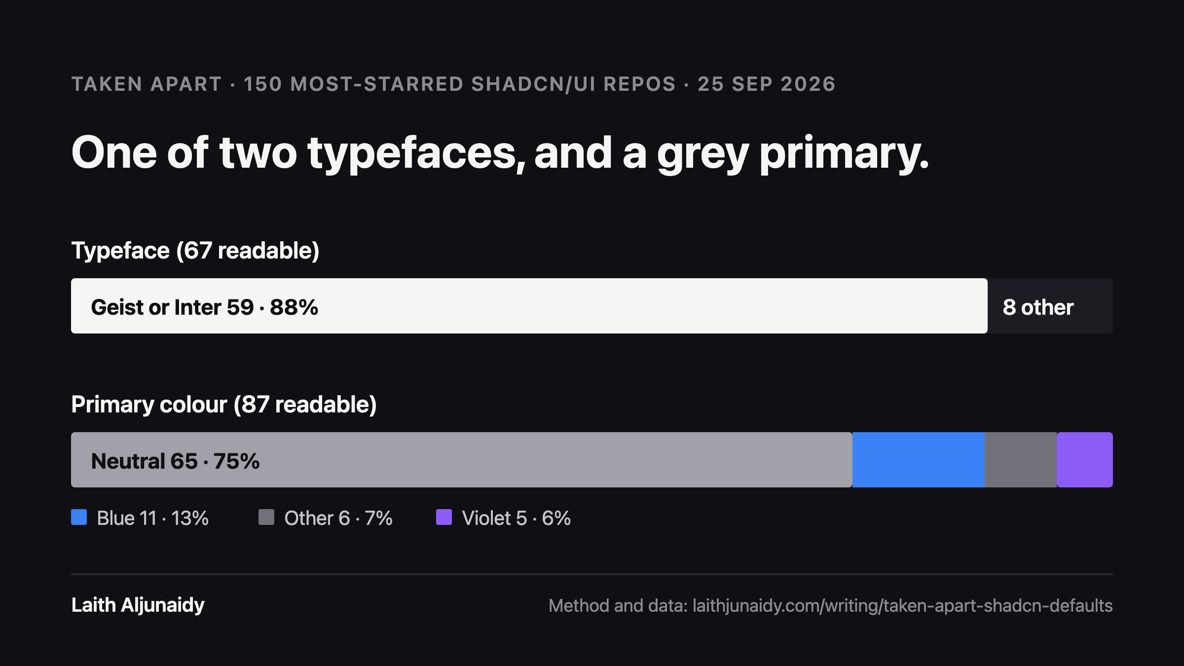
59 of the 67 repos with a readable typeface use Geist or Inter. That is 88 percent. Geist appears in 34, Inter in 28, and some load both. Only 8 chose anything else, spread across DM Sans, Manrope, Sora, Montserrat and a handful of others.
That is the real uniformity. It is not a bad choice, Geist and Inter are both excellent screen typefaces, but it means the first thing a reader sees is the same in almost every one of these products.
A grey primary, not a purple one
65 of the 87 readable primary colours are neutral: near-black or grey, straight from shadcn’s own base palettes. That is 75 percent. Blue is 11, or 13 percent. Violet is 5, or 6 percent.
So shadcn/ui is not where the purple comes from. Left alone, it ships grey. If your product is violet, somebody chose that, or something chose it for you.
What this means if you design with AI
The component library is not your brand problem. It gives you structure and a neutral surface on purpose. The sameness creeps in at two points: the typeface nobody changed, and the accent colour a tool filled in when nobody told it what to use.
Both are one decision each. Pick a typeface that carries your voice, set your own primary, and hand both to the model before it draws anything. That is the whole fix, and it is why the design system has to come first.
Method and data
Scanner, rules and raw results are open: scan_shadcn.py and results.json. Hue buckets use HSL (violet 240 to 300 degrees) and OKLCH (violet 265 to 320 degrees), and anything with saturation under 12 percent or chroma under 0.05 counts as neutral, which is where shadcn’s slate and zinc bases sit. The sample is the 150 most-starred repos with the tag, which includes libraries as well as apps; the median repo has about 1,700 stars.
This is the first Taken apart: one design question, measured by hand, method shown. If you want a question counted, tell me.