Cashley
A neo-banking app for freelancers in the United States: a brand built on one letter, three cards, and an app for instant loans.
Cashley is a neo-banking app for freelancers in the United States, built around one-click instant loans. With Branders, Laith Aljunaidy worked on its brand identity, a logotype and C mark built on speed, a lime and black palette, Roobert and Aeonik type, three card tiers and the brand in use, and designed the Cashley mobile app: balance and credit, instant loans, early repayment, top-ups, transfers, cards and linked bank accounts.
- Client
- Cashley
- Role
- Brand identity and app design, with Branders
- Location
- United States
- Year
- 2023 to 2024
Updated
Context
Freelancers get paid late and spend early. A bank that waits for a salary slip does not know what to do with them.
Cashley is a neo-banking app for freelancers in the United States, built around one idea: cash when you need it, in one click. Instant loans, a credit line that shows what is due and when, cards and transfers, all in one app.
The brief came with a problem. The earlier brand had split in two: one face for the friendly app, another for the instant loan feature that made Cashley different. The new identity had to bring them together.
One letter
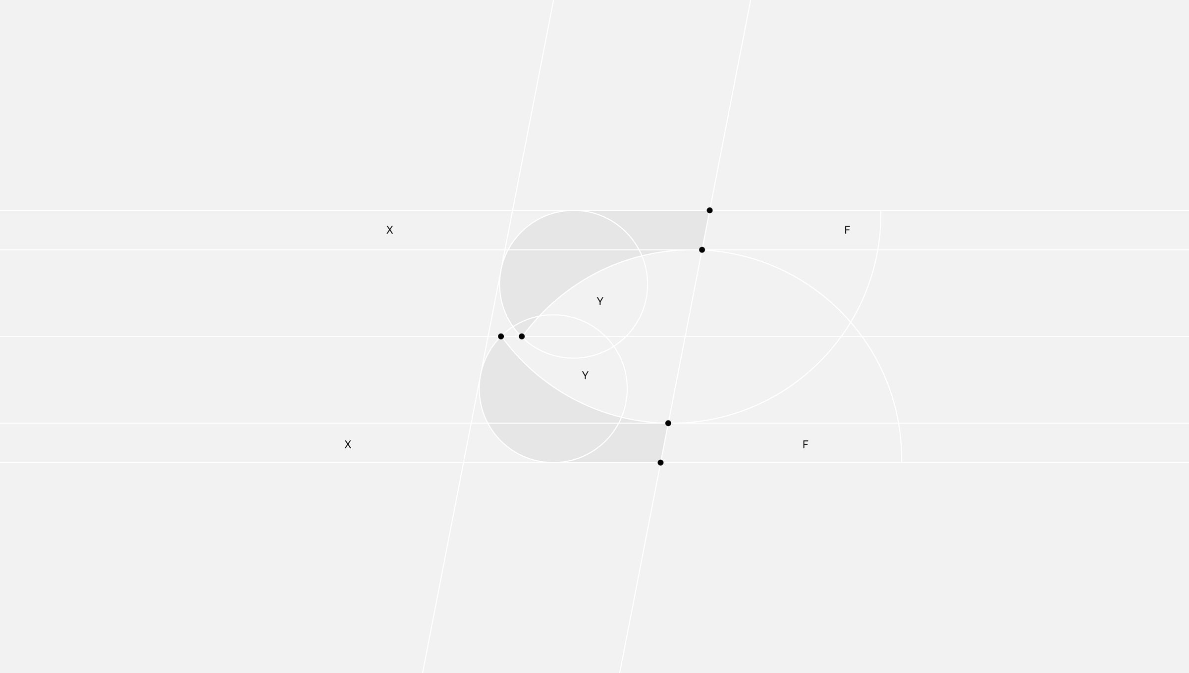
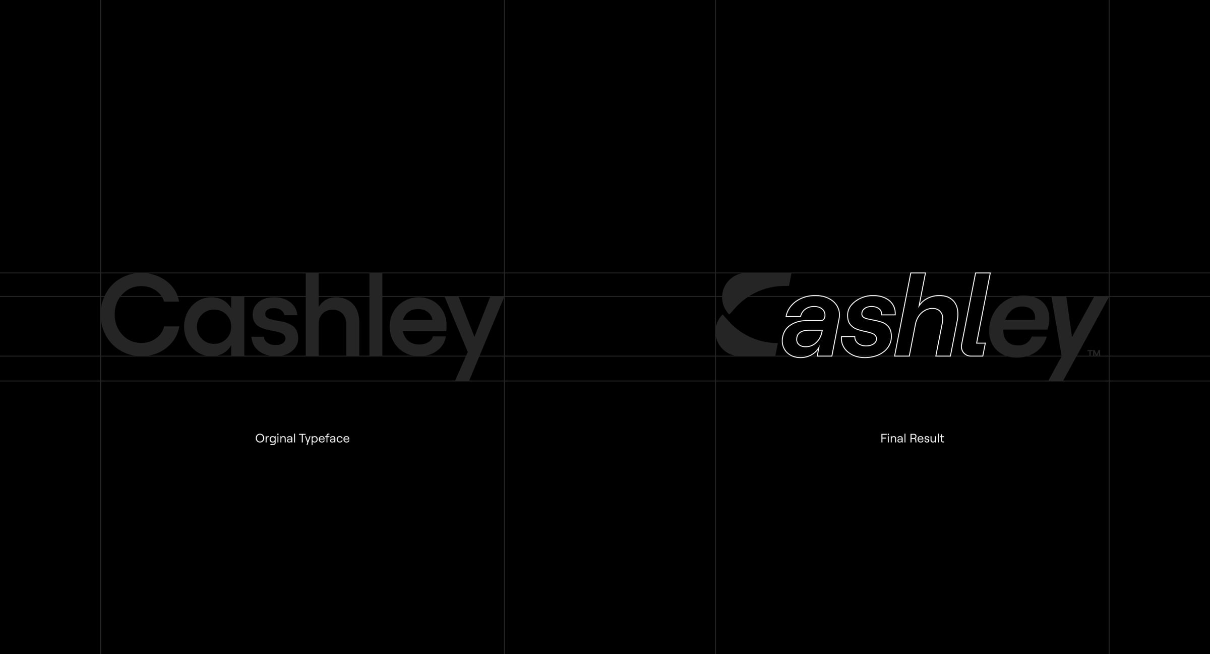
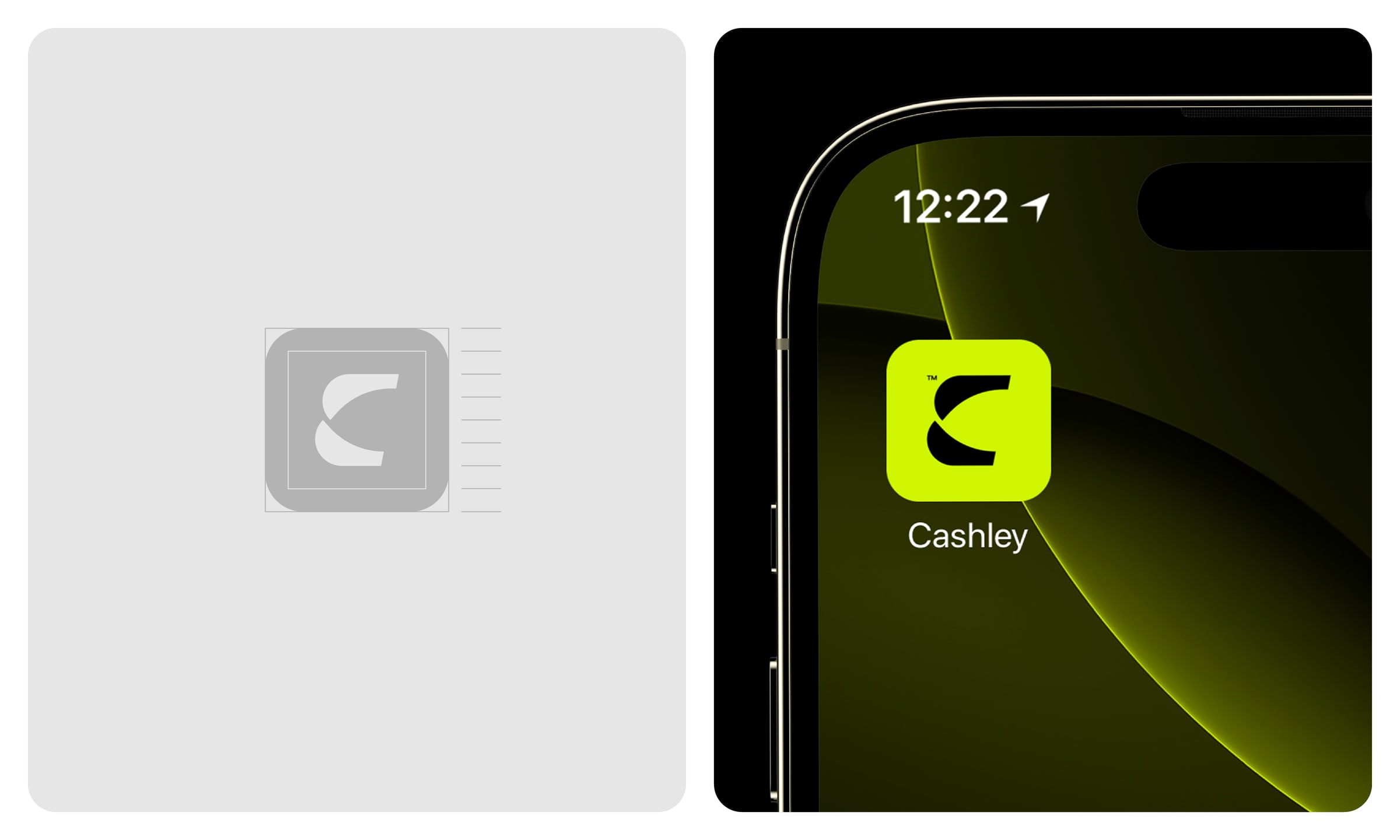
The answer was in the name. Looking at how the letters of Cashley meet, the C stopped being a letter and became a symbol: speed and motion, money moving forward.
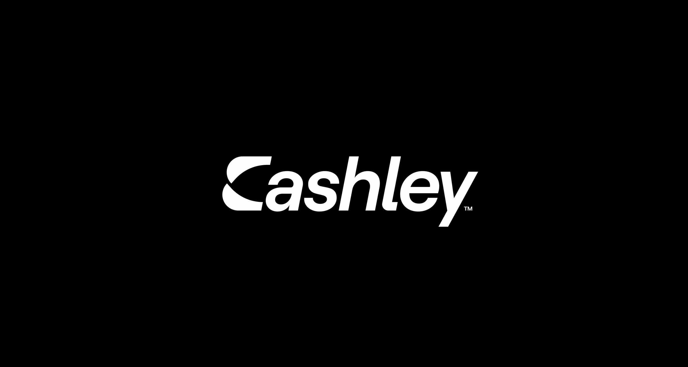
The C was drawn with a negative-space arrow running through it, so the letter launches forward. The rest of the wordmark follows its line.
Colour and type
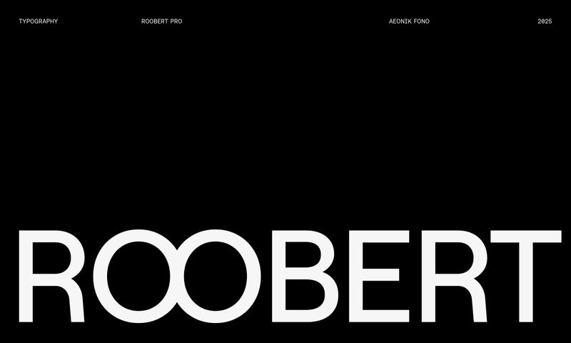
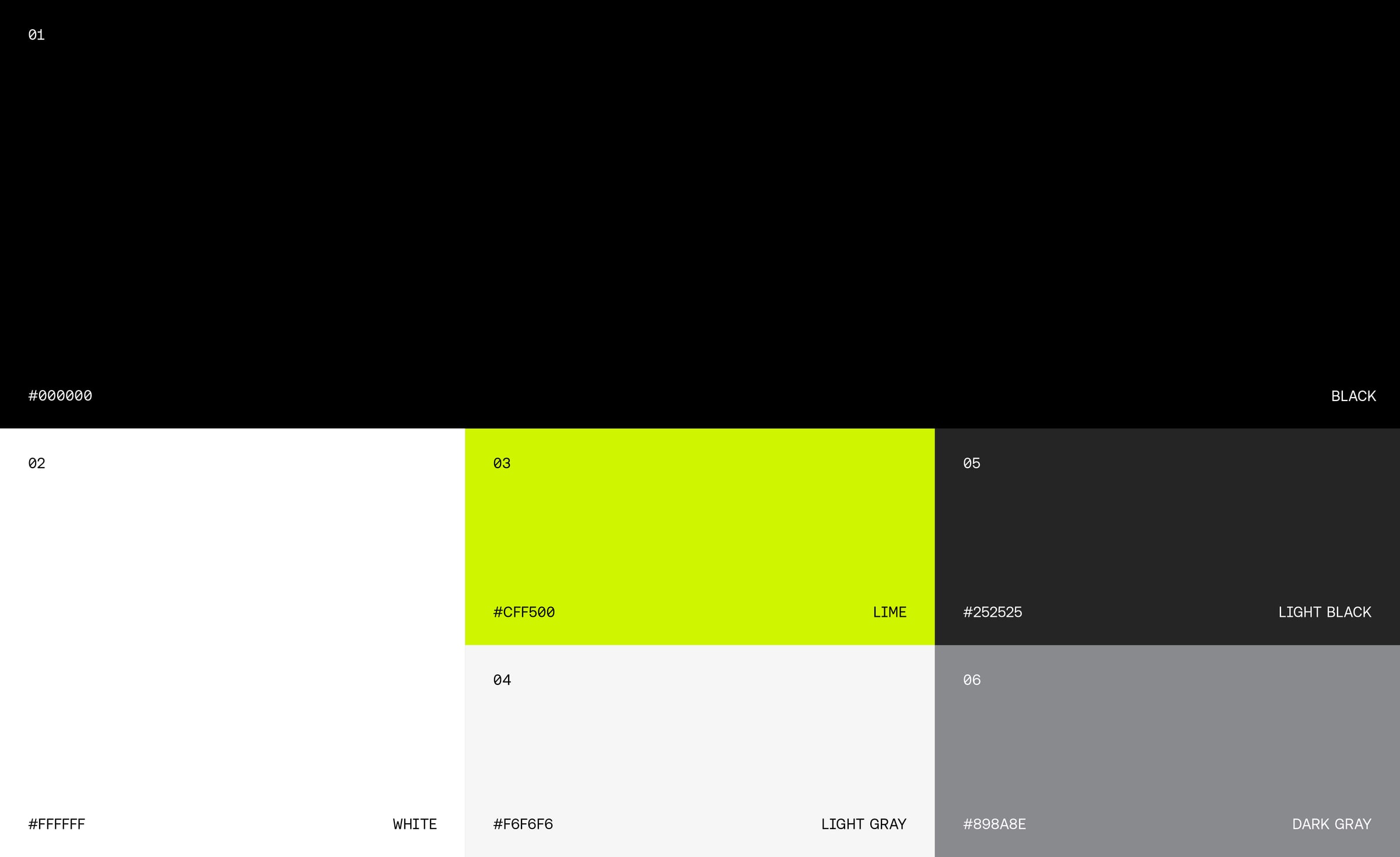
A sharp lime against black, white and greys. Roobert for display, bold and modern, with Aeonik Mono and Fono for numbers and detail.
Three cards
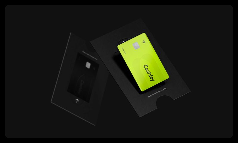
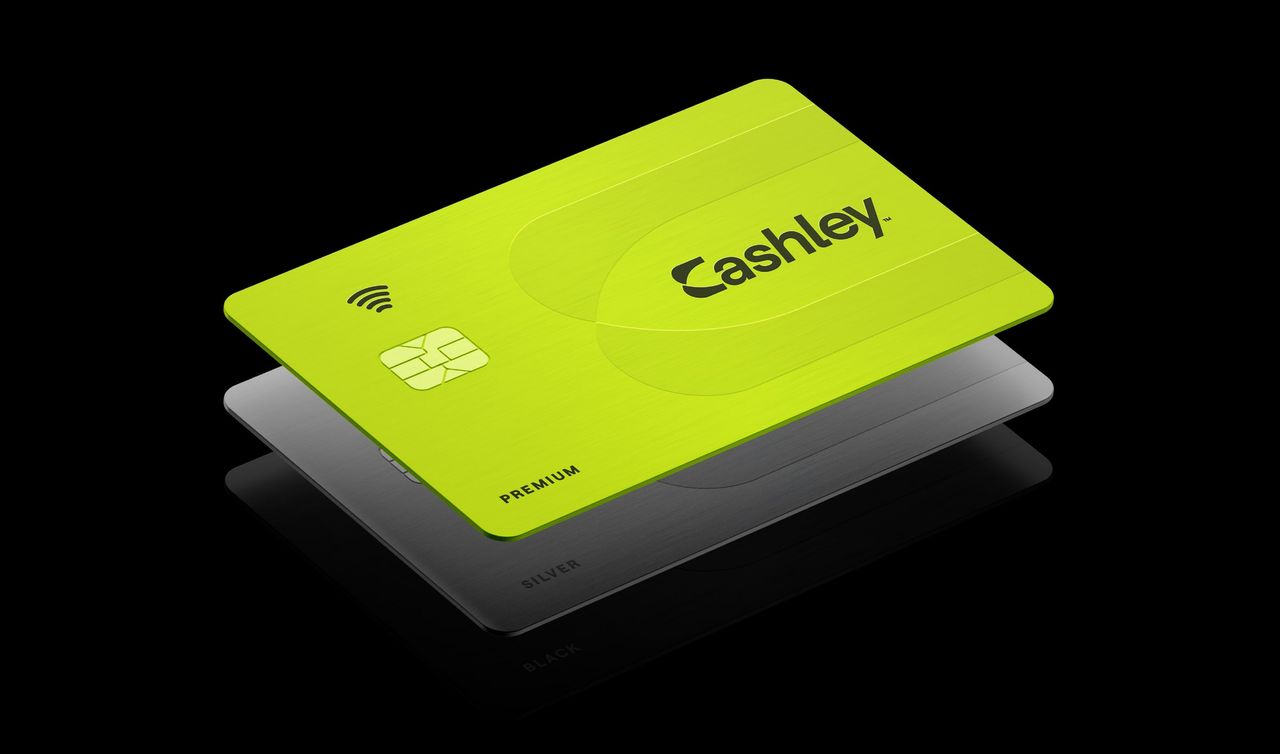
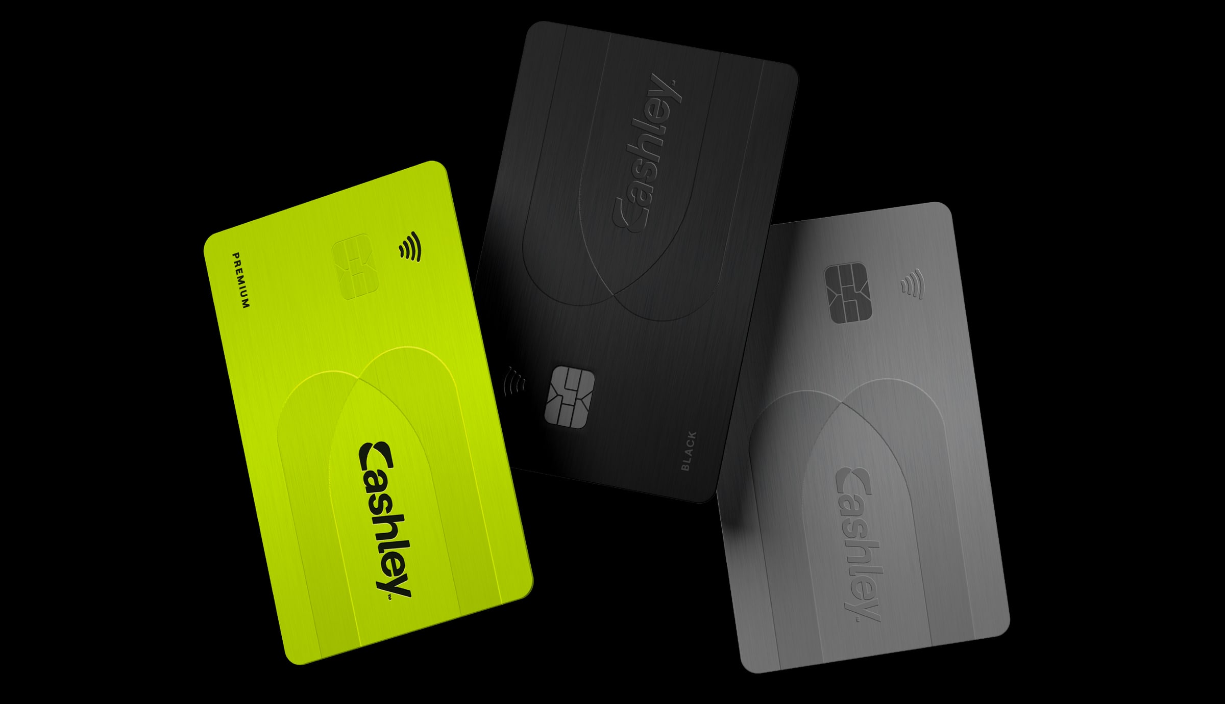
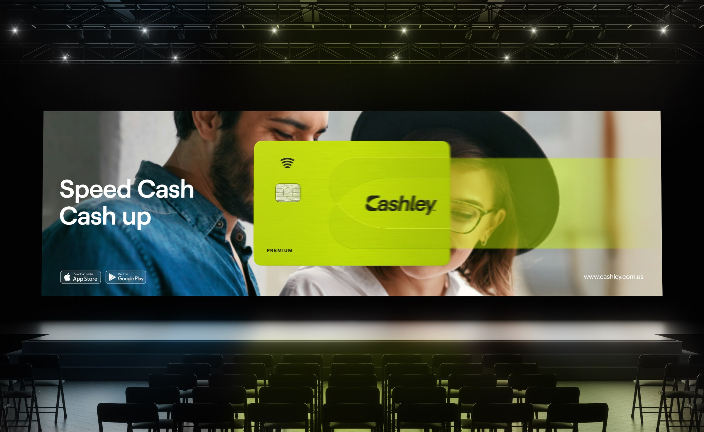
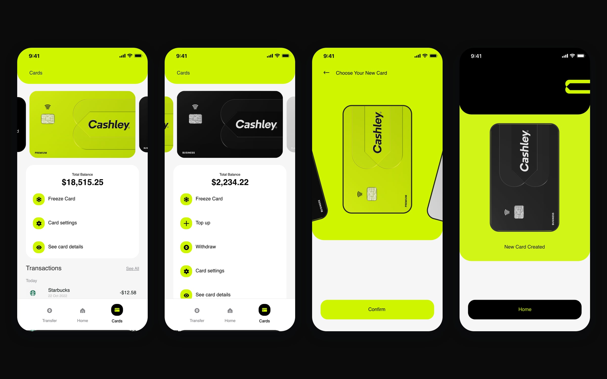
The cards come in three tiers, each with its own character: Black for business and power, Silver for balance, and Premium in lime, the most Cashley of the three. One central element on all of them, the C, so each one reads as the same brand from across a room.
The brand in use
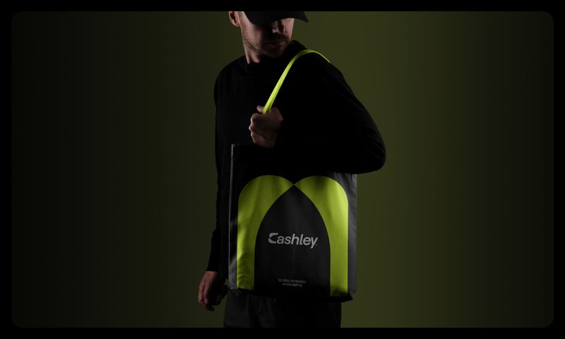
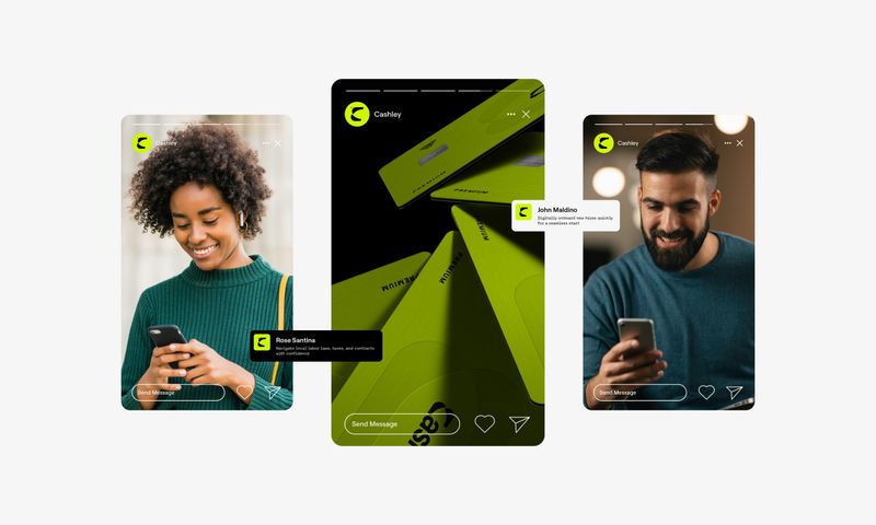
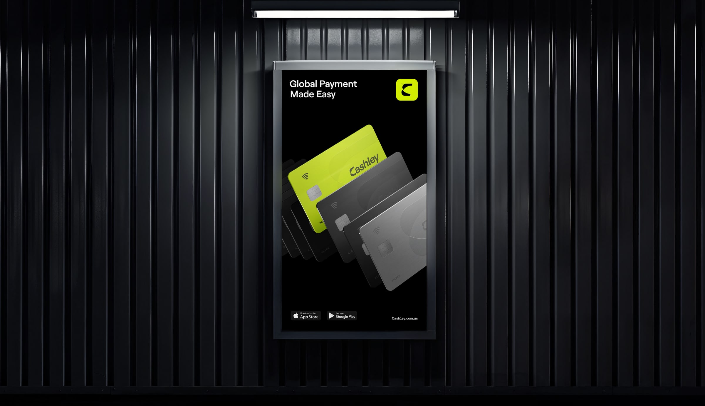
From a poster in a dark corridor to a stage screen and a tote bag, the system holds wherever it lands.
The app
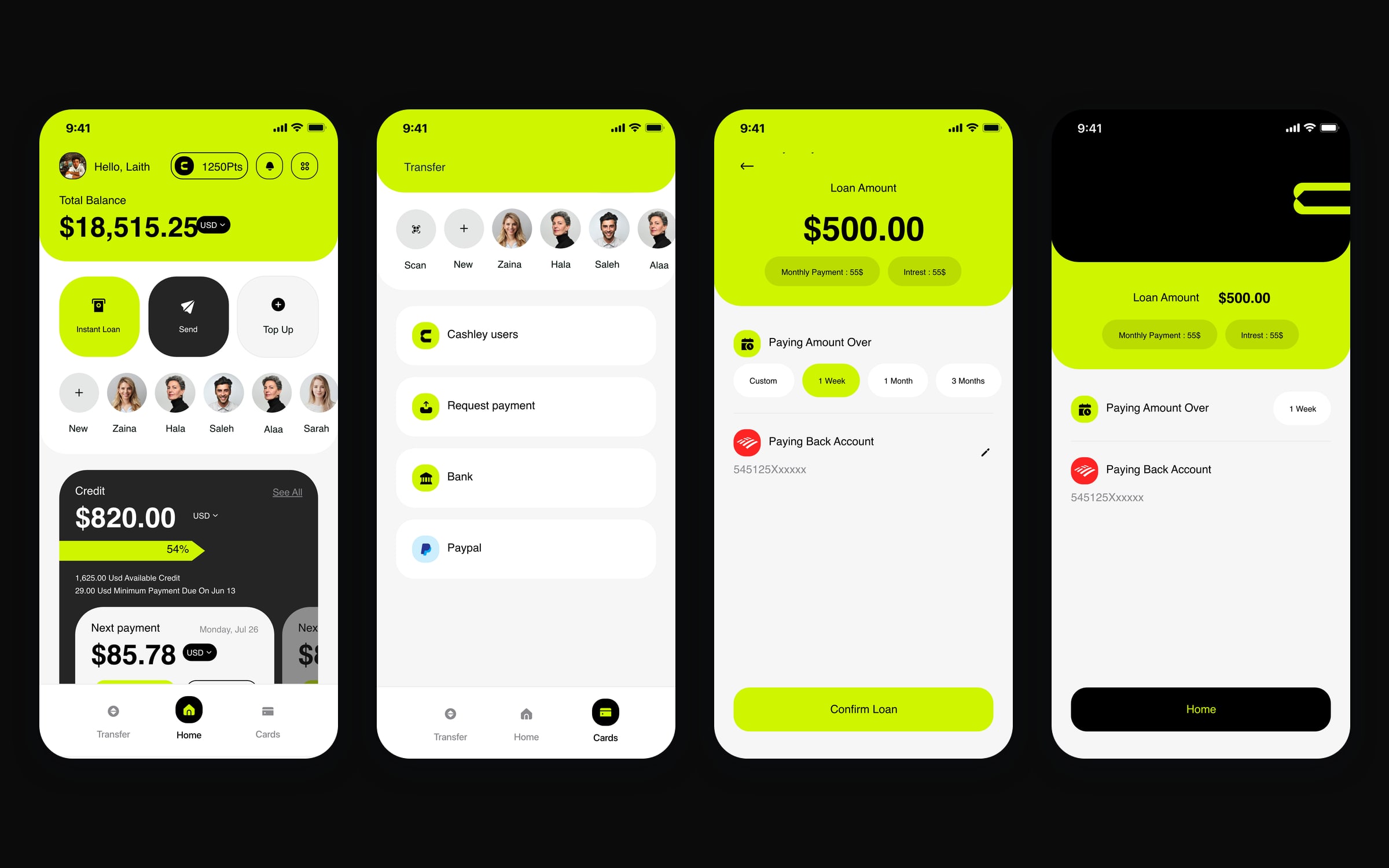
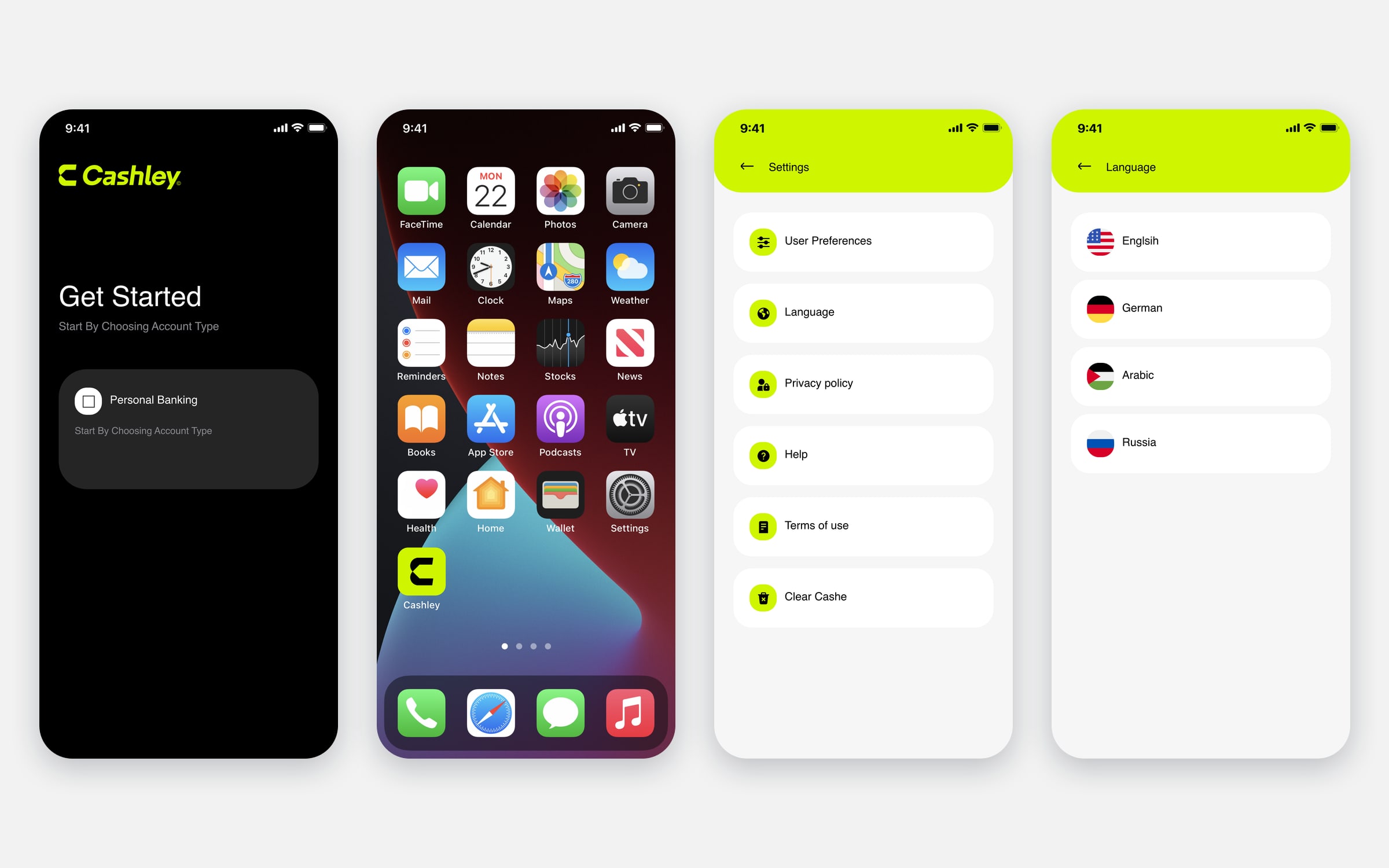
The app opens on the balance and the credit line, with Instant Loan, Send and Top Up one tap away and the people you pay most in a row underneath.
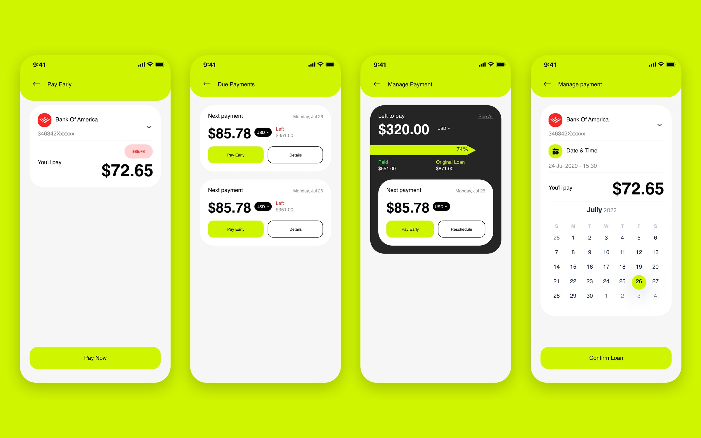
A loan takes three steps: the amount, the repayment period, confirm. Every payment that follows sits in view with its date, and can be paid early in one tap. Statements come for any period, as a file or a QR code.
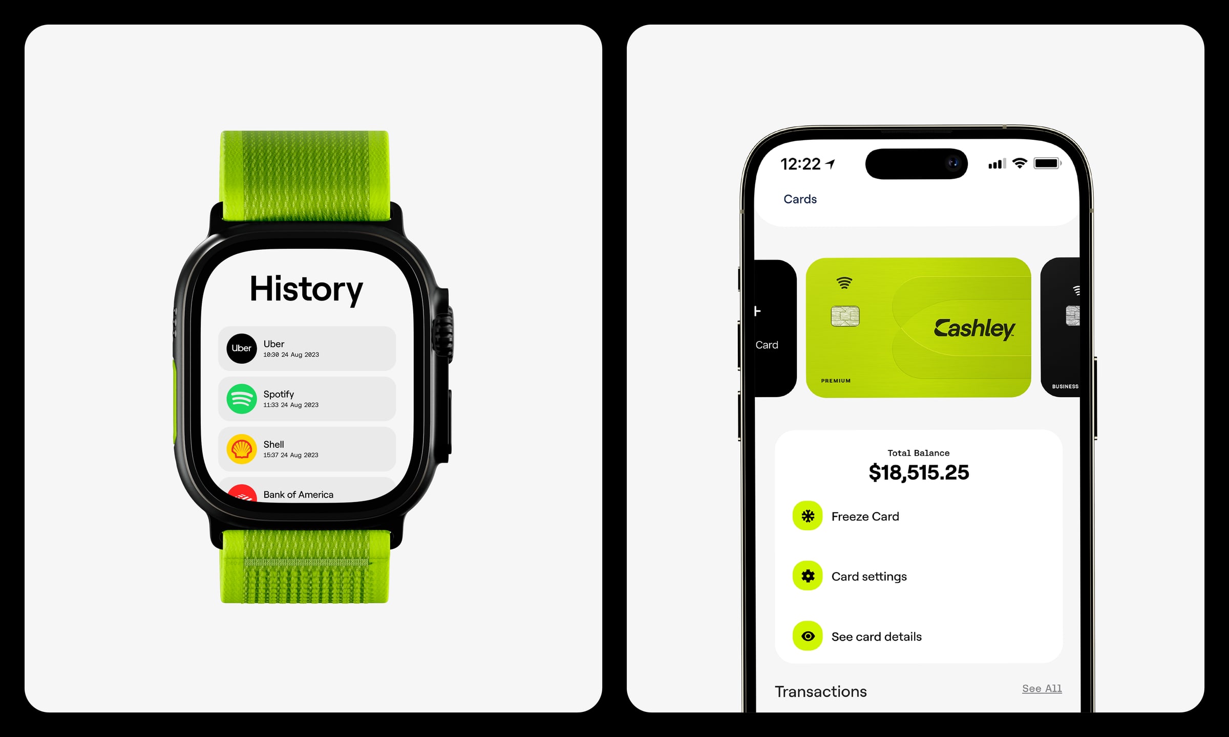
Cards live in their own space: freeze, settings, details, top up and withdraw. A new card starts with choosing its tier.
The same balance and cards follow to the wrist.
My role
I worked on the identity with the Branders team, from the mark to the card tiers and the brand in use, and I designed the Cashley app from onboarding to cards, loans, transfers and settings.
FAQ
What is Cashley?
Cashley is a neo-banking app for freelancers in the United States, built around one-click instant loans, with a credit line, early repayment, top-ups, transfers, cards and linked bank accounts.
What does the Cashley logo mean?
The C of Cashley carries a negative-space arrow, so the letter launches forward: speed and motion, money moving. The wordmark is built around it.
What fonts and colours does Cashley use?
Roobert for display and Aeonik Mono and Fono for numbers and detail, on a palette of lime, black, white and greys.
Gallery