The stand I designed and never saw
The story of Mercato's stand at Health Expo Iraq 2026, from the hall map to the last number in a print file, and what changes when a screen designer's work has to be built by a contractor.
On this page
- Where do people come from?
- What fits in 27 square metres?
- Can what’s in the render be built?
- What’s left when you lose a metre?
- Who owns the numbers now?
- Does the blue come out the same?
- Where does the wall end and the screen begin?
- Why is the screen black?
- What did it look like in reality?
- If this is your first physical job
- Sources
The first two messages I wrote about this stand, on the evening of 8 October 2026, had no colour or shape in them:
ابعتلي مخطط المكان كامل طيب
الناس من وين بتحي
Send me the whole hall plan. Where do people come from.
Twenty days later Health Expo Iraq would open at Baghdad International Fairgrounds, Hall 2, from 28 to 31 October. Mercato’s stand had to go from my files in Egypt to a hall in Baghdad, built by a contractor who reads only what I send.
I design screens and apps. A mistake on a screen means a new build. Here a wrong number means a wall that doesn’t fit.
This is for designers and founders who have lived on screens and are close to their first physical job: a stand, a shop, a sign. You need no background in exhibitions. I will tell it in the order it happened, mistakes included, and the images are the proof. An AI team helped build the files. The decisions are the subject.
What I didn’t know that night: I would follow opening day from Egypt. Everything that reached Baghdad had to work without me.
Where do people come from?
The stand sat in the back row: 9 m wide, 3 m deep, 27 square metres. Three flows reach it. People leaving the ministry pavilion walk a 3 m aisle between two blocks of stands and see the middle of our front from 12 to 16 m away. People from the main entrance reach the top aisle about 4 m before us and turn, so the west end is what they meet first. The third flow comes along the top aisle from the east.
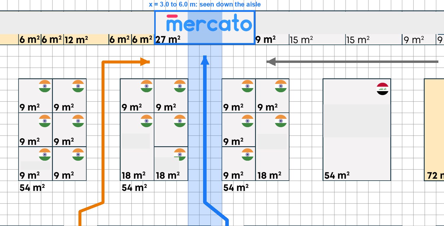
We know this question from screens: where does the user come in, and what do they see first. The difference is that this user walks, and a neighbour’s wall hides what is behind it.
The first drawing of the stand wasn’t mine. The client sent it: a floor plan at 9 metres, three walls with the front open to the aisle, an LED screen in the middle, two reception desks, an angled touch screen, a meeting table and a seating corner.
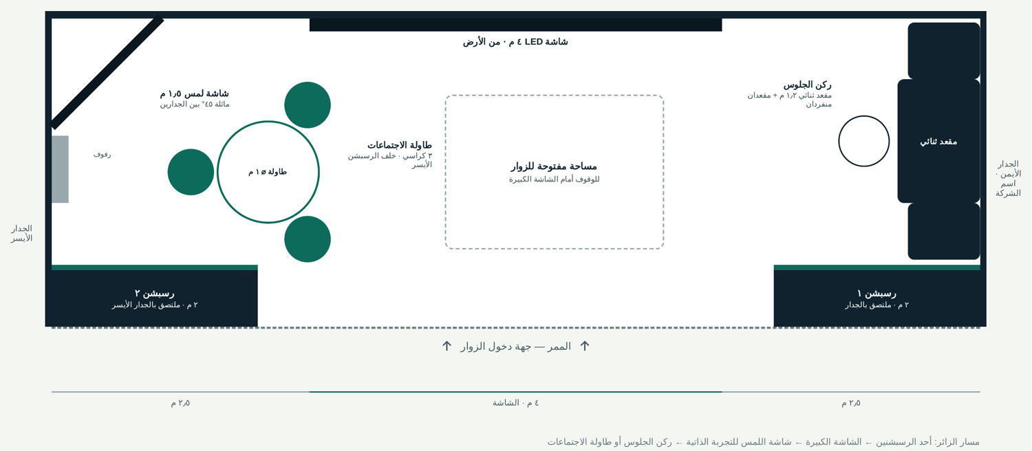
My plan started from it, and it wasn’t final. Most of it would change.
The zoning came out of the hall map. The large screen and the brand in the window seen from the ministry side. The touch screen to the west, where the entrance crowd arrives. Then I wrote four visitor journeys: a pharmacy owner walking past, a drug warehouse manager, a scientific-office manager with an appointment, an official delegation. Each had an entry point, a duration and an end.
The first evening ended with a flow map and a plan. Next question: what actually fits in 27 square metres?
What fits in 27 square metres?
I sent two references from Behance: a stand of 476 square metres and AUX at AWE 2024. The first is 17 times our floor. Of my first draft I wrote «لسا بعمل مليار احتمال»: still making a billion options.
The decisions that night came one after another, and all of them pulled the idea down to the floor:
- Few decor elements.
- No costly pieces.
- No wasted floor.
- The large screen starts at the floor and rises 3 m.
- Visitors stay apart: each has their own place.
I was working on the layout: «قاعد بعمل سميولسشن ع اكثر توزيع قوي حسب مبادى الinterior يلي درستهن», simulating the strongest arrangement from the interior principles I had studied. The test that changed the plan was simpler than any principle. One person explains in front of the screen to four visitors. Where do the five stand?
Dead end. I wanted the touch screen out in the aisle: «بدي اطلع الشاشه لبرا». The answer was no: not allowed, and anyone standing at it blocks the aisle. The aisle belongs to the hall, and that is the first line of your brief.
Second dead end. The first shape ideas were modelled directly, with no references: a drum, an m you walk through. I rejected them. Two rounds of browser renders came out weak in colour and light, so we moved to Blender Cycles, after the plan and the journeys.
What survived came from the constraints. Two pieces were required, with decor, so I proposed they take the form of a real device: «فيني خليهم بشكل تلفون حقيق», I can make them look like a real phone. Before dawn on 9 October I sent the idea for the stand: «متل pos حقيقي», like a real POS. And faced with costly materials my answer was «عادي خشب وانارة»: just wood and light.
By the end of 9 October we had a render that looked like a stand. Most of us skip the next question: can it be built?
Can what’s in the render be built?
The image convinces, and the camera tells you only what it sees.
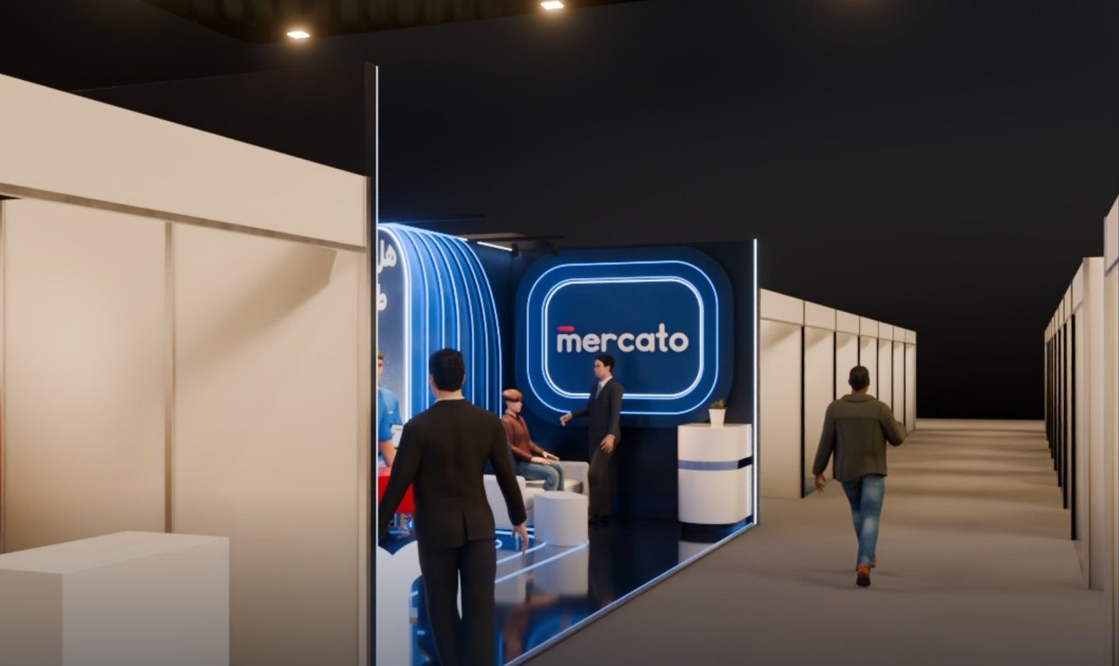
Space fell first. I rejected the layout five times because of the room: a counter walling off the meeting corner, a POS nobody could reach behind a table, dead corners. After that every layout went through a check of published numbers before any render:
| Check | Number | Source |
|---|---|---|
| Walkway for one person | 915 mm | ADA 403.5.1 |
| Staff zone behind a counter | 760 mm | Panero and Zelnik |
| Clear floor at a screen | 760 x 1220 mm | ADA 305.3 |
| Seat width per person | 530 to 710 mm | Panero and Zelnik |
| Gap between two pieces | under 100 or over 875 mm | Neufert |
After the space check passed I still found two faults by eye: the POS screen head 60 mm inside the west wall, and a 1.4 m sofa with one real seat. So we added a clash check, a simple set of questions put to the model: is anything inside anything, is anything floating, is anything outside the plot or over the height limit. The check found:
- 29 more clashes nobody had seen.
- Six spot heads at the model’s zero point, nowhere near their positions.
- A leaflet behind the back wall.
- Walls 20 mm over the 3.00 m limit and 140 mm outside the plot.
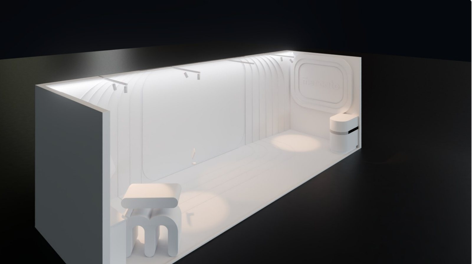
Then an engineering review read the pack from zero and found what I had missed across the sheets: two different floor build-ups, an LED that could not stand without tie-backs, and a build programme ending after the line that the stand be finished 48 hours before opening.
This was the first time the step appeared that repeats through the rest of the story: check it where it will live. A render lives in front of a camera. A wall lives in a hall with a height limit and a plot line.
The pack reached 67 pages and a clean model. Then the size changed.
What’s left when you lose a metre?
On 13 October, fifteen days before opening, the stand became 8 x 3 m. The screen stayed 4 m wide, so the whole metre came out of what surrounded it.
What went: the armchair, the side table, the brochure cabinet, the roll-ups and the west wall’s porthole.
The touch screen lost its place, so it moved onto a full-height wall at 45 degrees across the back-west corner, with no stand. The corner now carried the device people try with their own hands.
The real sofa’s measurements arrived: two modules, each 820 x 850 mm. Before that I was drawing a sofa. From here I was placing something that exists.
The biggest decision was on the back wall.
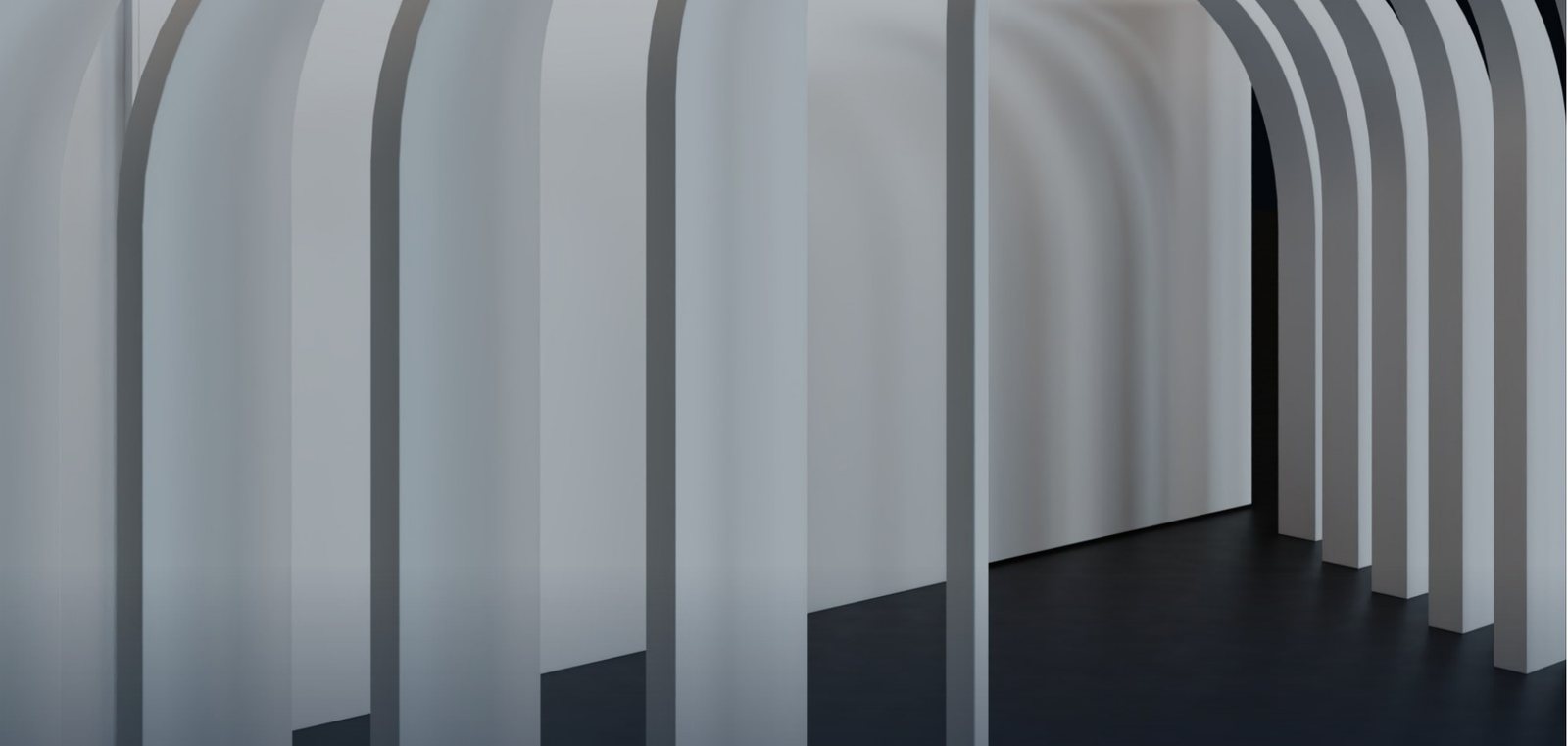
Eight frames mean carpentry, lighting and installation. On 13 October the wall became a printed sticker: the same rings, with the depth now drawn. The risk moved from the carpenter to the printer, and the first fabrication pack was ready: 10 sheets, cut files and print files.
Now every number had more than one reader. So: who owns the numbers?
Who owns the numbers now?
On 18 October the plan changed again: 200 mm wood walls from the build side, and a 1600 mm slanted face. I rebuilt the model on it. On 24 October the screen itself moved: the left of the back wall became 1000 mm, from 668.6, and the right 1449, from 1800.
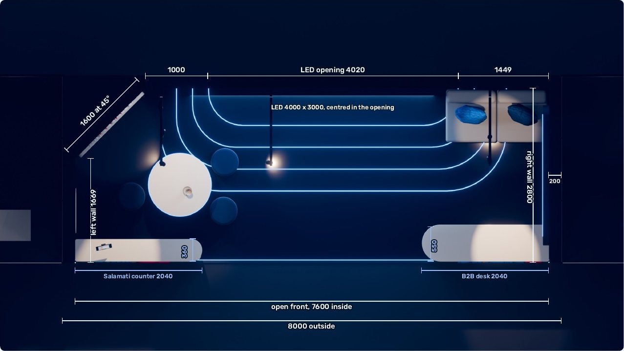
In an app a number lives in one place. Here the same number sits in the contractor’s sheet, the printer’s file and the letter-cutting file. So the sheets came from one data source and a change passed through all of them at once, like a token in a design system. And because this handoff goes to nobody who can ask you a question, add up the numbers yourself before the contractor adds them on the wall:
| Piece | mm |
|---|---|
| Slanted wall, its run along the back (1600 at 45 degrees) | 1131 |
| Back wall, left | 1000 |
| Screen opening | 4020 |
| Back wall, right | 1449 |
| Inside width | 7600 |
| The two side walls, 200 each | 400 |
| Outside width | 8000 |
The depth checks the same way: 1669 for the left wall plus 1131 for the slant makes 2800, the length of the right wall.
Some numbers I never had. The right wall carries a steel frame and a lit sign that Mercato owns, and their sizes reached me from a photo: about 3000 mm for the bars and 2450 x 470 mm for the sign. I wrote on the sheet: to measure on site. The sticker behind them came in two drops, 1520 mm wide at most, overlapping 20 mm, with the joint at 1400 mm behind the sign so nobody sees it.
The walls were fixed on paper. Colour was left.
Does the blue come out the same?
Mercato blue, #1B79F5, exists on a screen because a screen makes it from light. A press makes it from ink, and this blue is outside what CMYK can reach on any press.
The difference between two colours is measured by a number called dE: under 2 the eye can’t see it, 2 to 5 is close, over 5 needs a proof.
| Blue build | CMYK | dE |
|---|---|---|
| Straight conversion | C82 M55 Y0 K0 | 7.6 |
| Approved build | C76 M45 Y0 K0 | 5.1 |
The best build stayed at 5.1. So the number itself asks for a proof, and nothing on a screen replaces one.
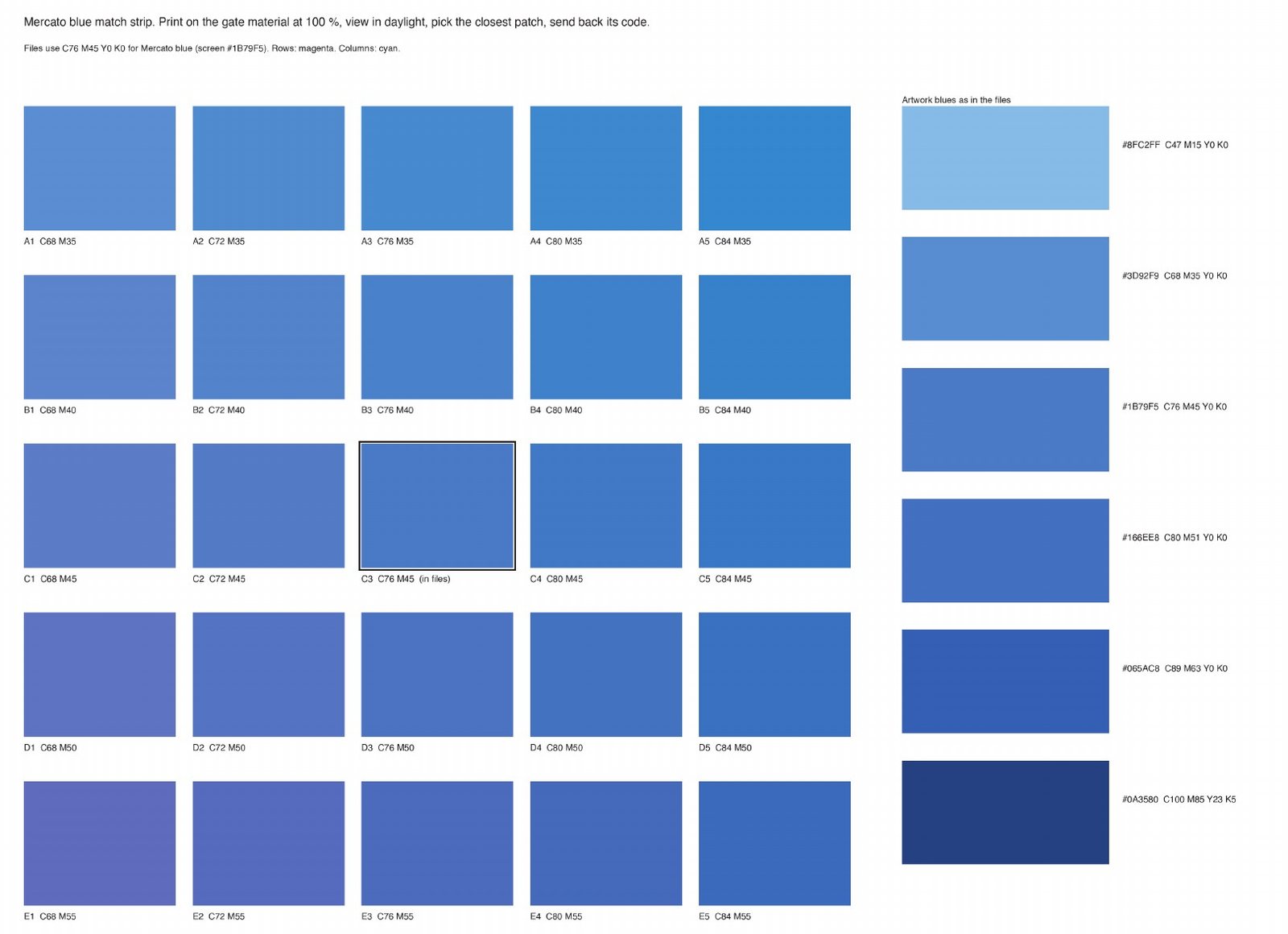
The method came from a gate we had printed before, and the aim was plain: «عشان ارجع اخد نفس تاثير البوابه للحيط نفسها», to get the gate’s effect back on the wall itself. You print the strip first, on the real material at 100 percent, look at it in daylight, pick the closest patch and send back its code. The printer answers here. For the sticker we added a second strip: a 380 x 230 mm piece of the wall in an RGB and a CMYK version, on the actual vinyl, side by side, because wide-format printers on an RGB workflow keep a blue FOGRA39 can’t reach. Check it where it will live, and this time it lives on vinyl.
I have no record of the code that came back on this job. I have the method and the files.
Dead end. We cut the wall’s artwork from the render itself. The 24 October version carried the render’s lighting with it.
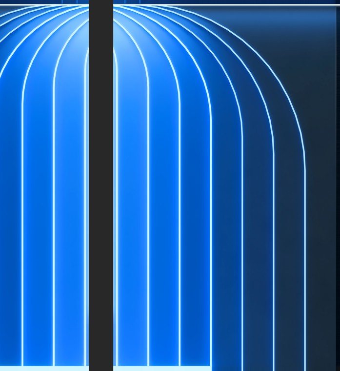
The white bar and black band at the top were the wall’s lit edge in the 3D scene. The pale band at the bottom was the floor’s glow. The bleed was a stretched row of edge pixels. Light in a render is not ink, and printed it would come out on the wall as a line that means nothing. We rebuilt the file that same evening from clean rows only, with 40 mm of bleed made of the artwork itself.
The print and fabrication files left for Baghdad. One thing on the stand still moved.
Where does the wall end and the screen begin?
I didn’t want a lit rectangle in a wall. The screen had to continue the sticker, so we measured the printed rings and built the display frame from their numbers: 257 mm per ring, and a corner radius of 550 mm growing by 135.7 per ring. The display area is 4000 x 3000 mm. On 28 October we matched the frame’s lines to the right-side stickers.
Two days before opening a problem came that had nothing to do with the screen: a neighbouring stand rose and hid ours from the aisles, and the sticker install on site was not going easily. We were in the back row, and that had been the case for 4 m at the start of the plan, before we settled on 3.00 m on 9 October. The fix came on the screen: we enlarged the logo so it showed through the aisles.
The frame was ready and so were the files. Then the screen met the booth’s computer.
Why is the screen black?
On 27 October the screen went up and the first problem appeared: the PC sent a 1920 x 1080 picture to a 4:3 wall, squeezing everything 25 percent. We set the output to 1440 x 1080. Windows was at 125 percent scaling, a second number that changes the maths and shows up in no design file. And I lifted the key content to the eye line of someone standing at the screen.
On 29 October the screen was black. The cause was a calibration page left open after measuring, covering the whole display. Now it hides itself after 60 seconds.
Then the slowness. On my Mac the show ran smoothly. On the booth’s computer it ran at 15 to 20 frames a second with the fans at full speed. The cause, in a designer’s words: blur and glass layers over a 3D world that never stops moving, so the machine recalculates all the blur on every frame. My machine hid the problem. We turned the blur into something drawn once and kept, and switched the glass off, and the show became two to three times smoother. The iceberg scene stayed stuck at 11 frames, and the stand’s internet dropped every 10 to 20 minutes.
The next day I wrote «الشاشه صارت 60 fps»: the screen is at 60 fps now. The first report showed 3,638 frames with not one slow frame.
For the third time in this story, the version that looked right was living somewhere other than its real place. The render, the screen’s blue, my machine. Check it where it will live.
What did it look like in reality?
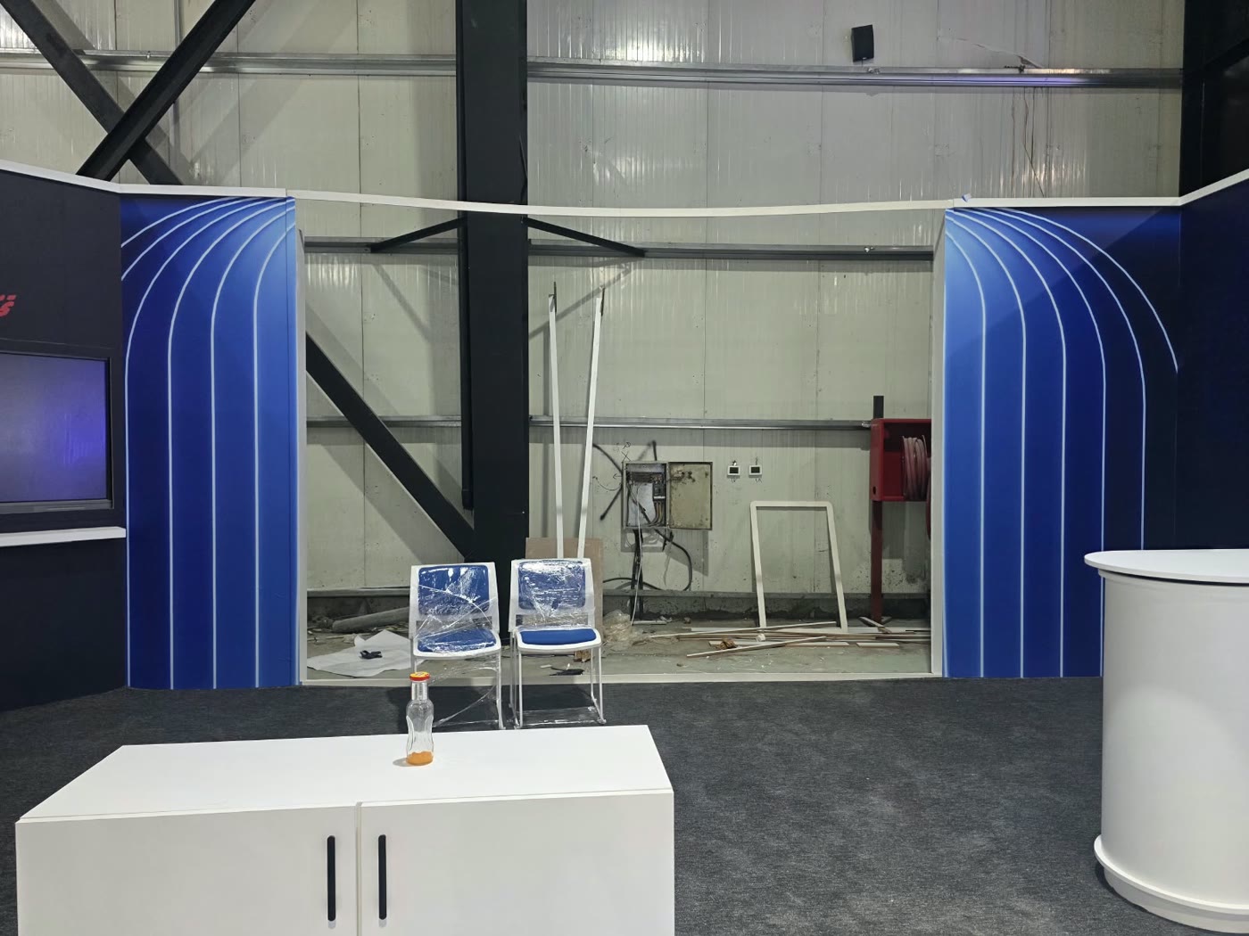
The fair opened on 28 October and I was in Egypt. I was changing the screen remotely, and the stand reached me as photos.
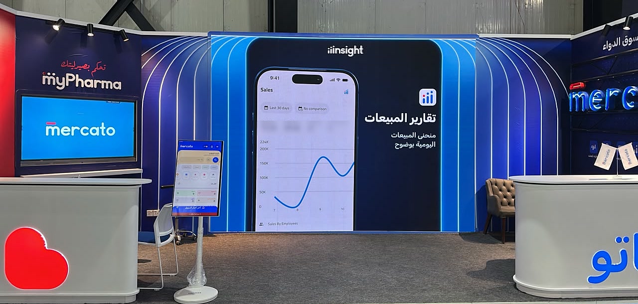
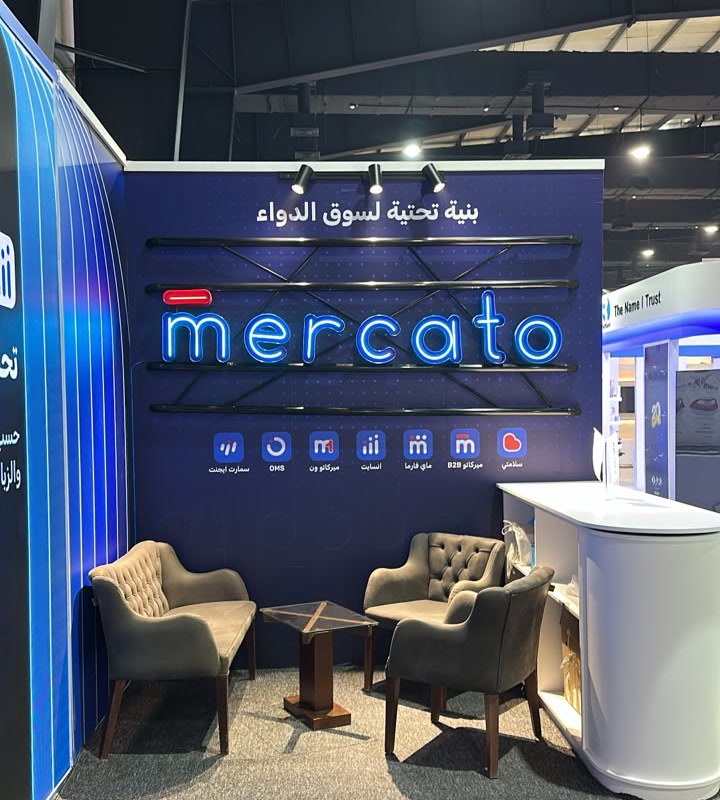
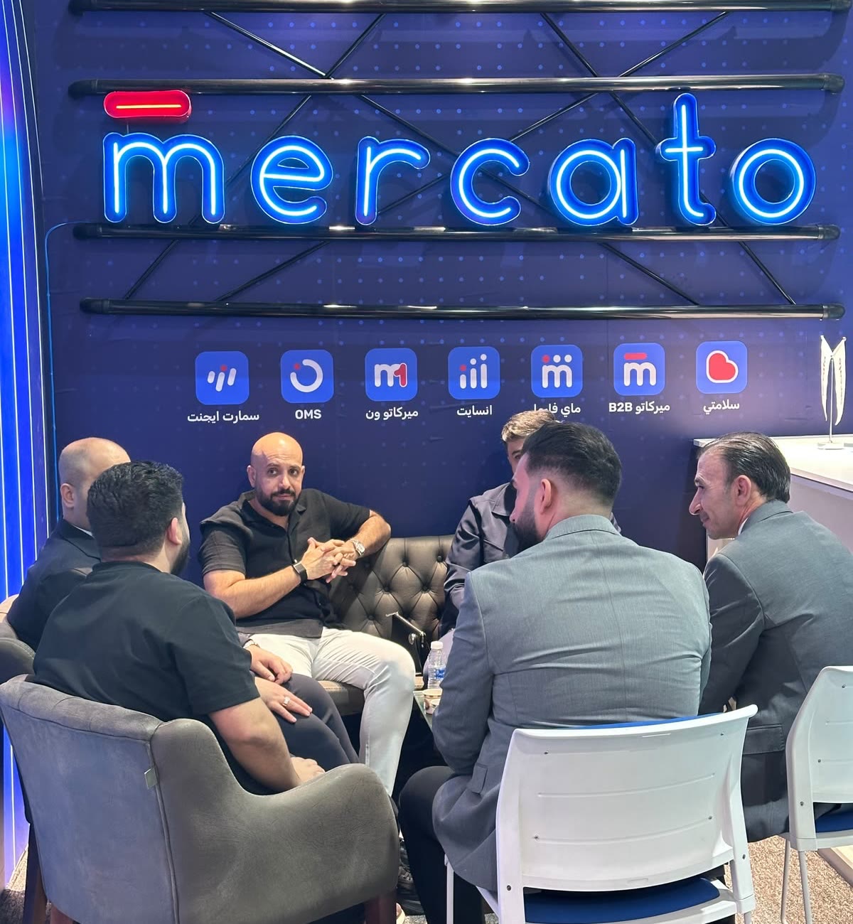

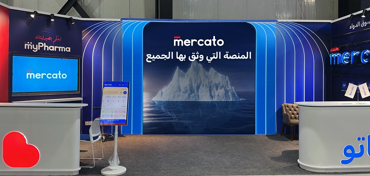
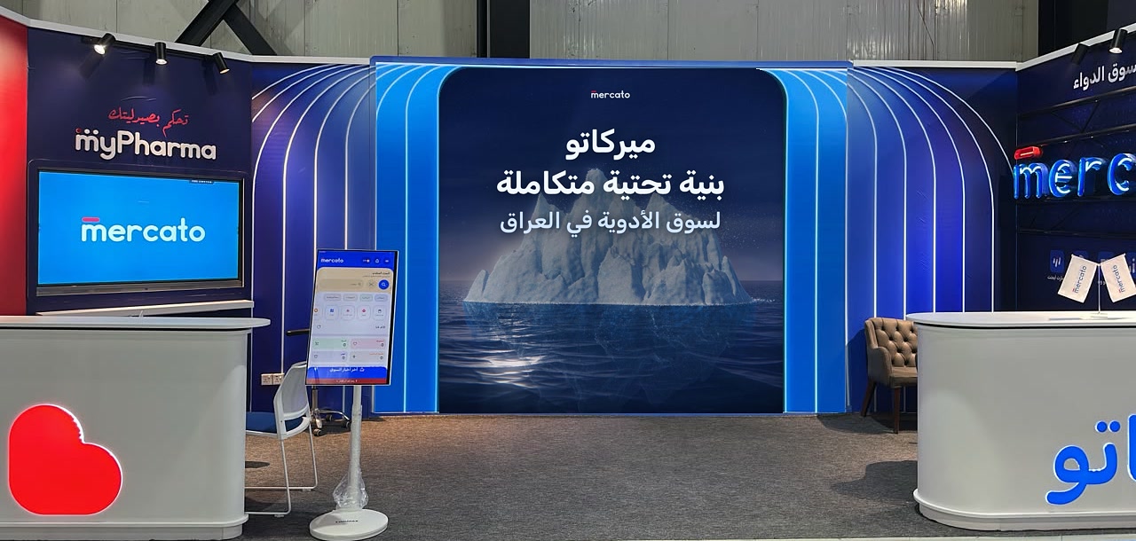
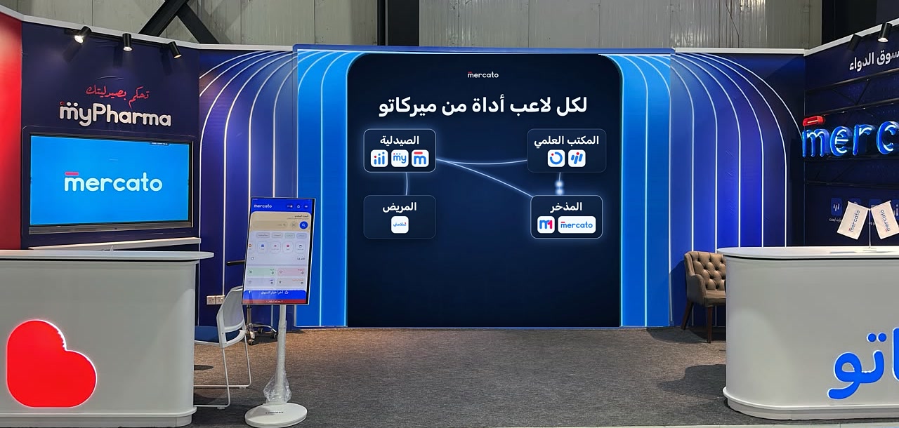
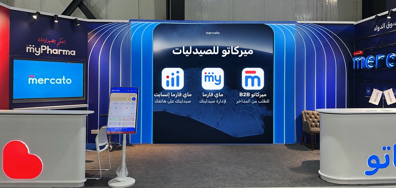
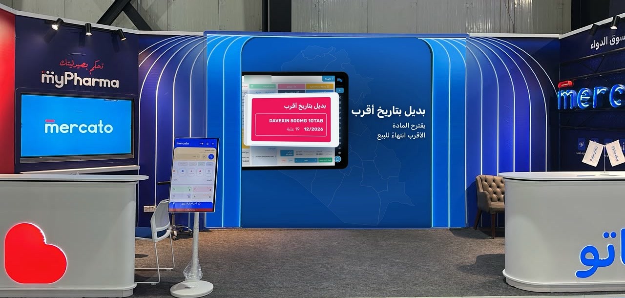
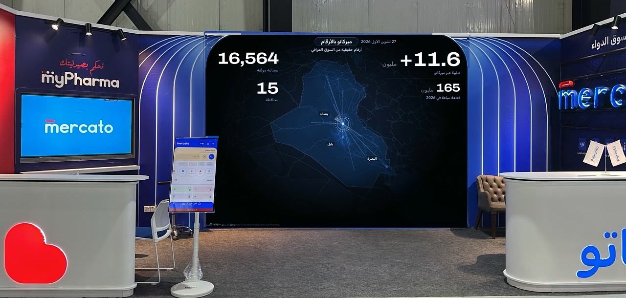
What matched the files: the red wall, the Salamati device, the slanted myPharma wall, the rings, the sign, and the frame meeting the sticker.
What differed: the sofa in the photos is dark and tufted, not the two grey modules in my model. The floor is grey carpet. The white chairs were never in the model. I have no record of the reason for each change.
On the evening of 30 October I wrote «انا بالمطار تاع مصر»: I’m at the airport in Egypt. I reached Iraq in the early hours of 31 October, the last day of the fair.
I never reached the stand. I’m writing this from Erbil, waiting on the next step in pitching a new, very special feature. The stand that began with a question about how people get to it, I have still only seen in photos.
If this is your first physical job
- Instead of starting with the form, start with the hall map and ask where people come from.
- Instead of taking a reference as it is, divide its floor by yours. 476 over 27 is 17 times: most of the idea won’t fit.
- Instead of judging the render by eye, check the model: clashes, floating things, the plot and the height limit.
- Instead of arguing the layout from principles, put five people on the floor: one explaining, four listening.
- Instead of defending every piece when the floor shrinks, ask which wasted corner can carry a job.
- Instead of leaving the numbers to whoever builds, add them up yourself, across and deep.
- Instead of writing a number you don’t have, write: to measure on site.
- Instead of cutting print art from the render, build it from the source. Light is not ink.
- Instead of approving colour on a screen, print a test strip on the real material.
- Instead of measuring performance on your own machine, measure it on the one that will run the show.
The question every founder asks: why all this 3D with a tight budget and little time? I kept it for two reasons. The space and clash checks run on the model itself, so without it there is nothing to check. And I wasn’t there, so the model was the only place everyone could walk through before the wall existed.
Sources
- a stand of 476 square metres behance.net
- AUX at AWE 2024 behance.net